Rainbow Charts Silver Analysis & Rainbow Charts Trading Signals
Developed by Mel Widner
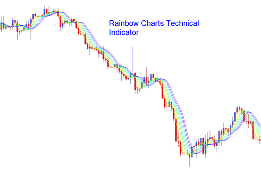
This is a trend following indicator, similar to the moving averages - it is drawn using a 2 period simple moving average. Moving average is then smoothed to create a total of ten moving averages. First moving average is the basis, then the next moving average is calculated using the first one, the third is then calculated using the second one and so on. This forms a rainbow shape of the trend, each moving average is applied with a different colors so as to look as a rainbow.
Technical Analysis & Generating Trade Signals
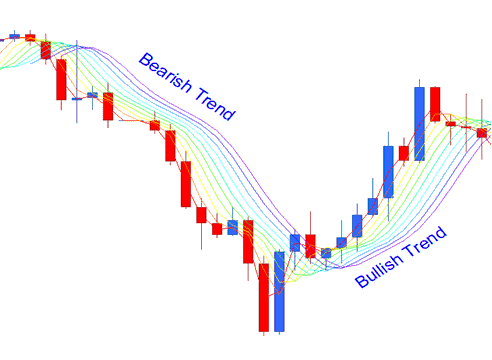
Bullish Silver Trading Trend/ Upward XAGUSD Trading Trend
When the trend in the market is Upward/bullish trend, then the rainbow will be moving upward, the least smoothed line will be at the top of the indicator, this is the red-line and the major smoothed line will be at the bottom of the indicator, this is the violet line.
Bearish Market/Downwards Trend
When the trend is a bearish downwards then the rainbow charts will be moving downward, the major smoothed line (Violet) will be at the bottom & the least smoothed line (Red) will be at the top.
Trend Continuation Signal
As the trend continues in one direction up or down, the rainbow charts follow the trading price closely. The more the trading price moves away from the rainbow chart the more the trend is likely to continue, this is considered as a trend continuation signal. The indicator lines will also continue to expand its width; this is also another trend continuation signal.
Trend Reversal Signal
When xagusd trading price starts moving towards the rainbow charts then this is seen as a trend reversal signal. The width of the indicator lines also contracts signifying a trend reversal signal. The reversal Signal is confirmed when the trading price penetrates through all the rainbow charts and the direction of the rainbow charts also reverses in their respective direction.
What is a Trading Plan? - Writing a Plan Example Template
Alternatives: EA Automated Robots or Copier Trading Signals