Types of XAUUSD Charts
XAUUSD trading offers three chart types for gold.
Charts are visual ways to see how prices change: they're made on a grid and can show different time periods, like charts for each minute, every five or fifteen minutes, or every hour, four hours, day, week, or month.
One will choose the chart timeframe to trade with based on their style of for the day traders they'll select and choose the 15 minutes trading charts and scalpers will use the 1 Minutes charts, swing traders will use the hourly charts.
These trading charts can be drawn using different chart representations, these are:
- Line Charts
- Bar Charts
- Candles Charts
Line Charts
The line chart is one continuous line that is drawn to represent the closing price, if one is using the five minutes charts then the closing price for every 5 minutes is drawn and linked to the next close of the next 5 minutes thence this forms one continuous line that forms the line chart.
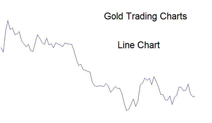
This chart type skips key details on gold price moves. It just shows closing prices. No highs, lows, or opens. Line charts aren't popular with XAUUSD traders. They like bar or candlestick charts that include all that data.
Bar Chart
Bar charts will display all the details about price data: this data is called O-H-C-L - Opening price, Highest Price, Closing Price, and Lowest Price.
Bar charts visually represent data with two distinct colors: red for price decreases and blue for price increases. Refer to the chart below for further details.
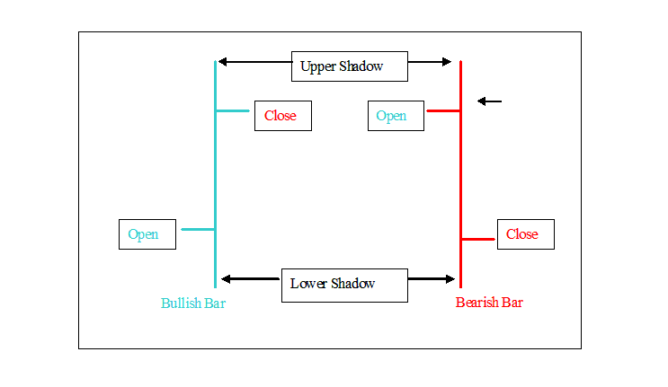
Bar charts show all the price data you see above. The vertical bar shows the total price movement for that period, the left horizontal bar is where the price opened, and the right side is where it closed. The highest point of the bar is the high, and the lowest point is the low.
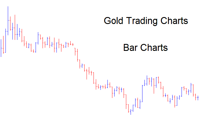
These chart visuals are generally not aesthetically pleasing when positioned in close proximity, as illustrated below: consequently, these bar charts are infrequently employed in gold trading contexts for explanatory purposes.
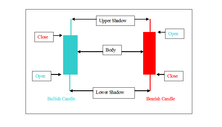
Candle Charts
These are the most commonly used types of charts - these chart show all the info of price - OHCL in an easy to interpret and analyze format.The candle charts are of two different colour, red for when price heads down and blue for when price heads upward.
These candlesticks charts look like candlesticks with wicks on both sides. The body of the candle illustrates difference between opening price and closing price. The high and low that are represented by what's known as the shadow this is the part that looks like candle wicks represents the highest price & lowest price.
An illustration of how xauusd charts look is displayed:
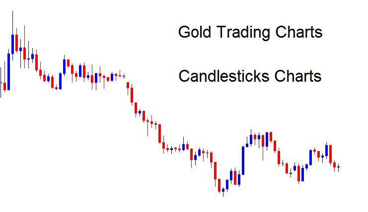
This is the most commonly used chart when it comes to gold.
Traders can alternate between these different chart display formats on the trading software by utilizing the buttons illustrated beneath.
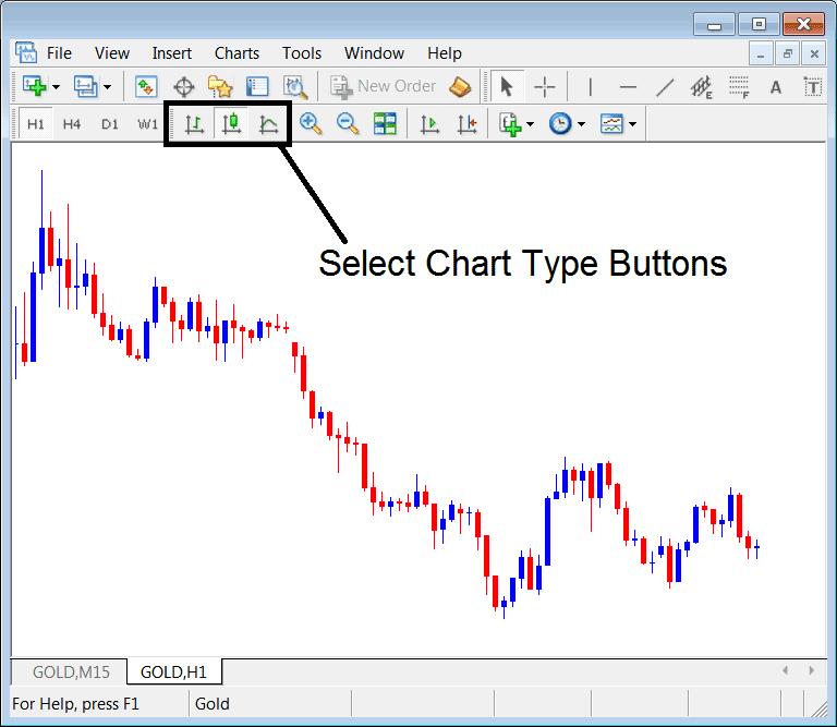
Traders have the option to switch seamlessly between various chart visualization types using the platform buttons provided when trading the xauusd market.
More Topics and Courses:
- Identifying Overbought and Oversold Levels Using the RSI for XAUUSD
- Setting Up an Expert Advisor (EA) for FX Accumulation/Distribution
- Drawing Lines & Channels Going Down in XAUUSD Charts
- Methods of Scalping XAUUSD, Day Gold, Swing Trade Gold and Position XAU/USD
- Meaning of Fib Extension Levels in MT4 XAU/USD Trade Platform
- List of Easy XAU/USD Plans for Those New to XAU/USD
- How Can You Trade Inverse Head and Shoulders XAU/USD?